Color Contrast Accessibility
I designed a color contrast accessibility reference guide that mapped brand colors to WCAG standards, enabling teams to quickly assess compliance and design accessible interfaces with confidence.
Role
Discovery, Design
The User & Opportunity
Internal stakeholders created presentations and documentation as part of their daily work, presenting an opportunity to better embed accessibility considerations.
Goal
The goal was to equip internal stakeholders with a quick reference guide that simplifies accessibility best practices and supports compliant content creation
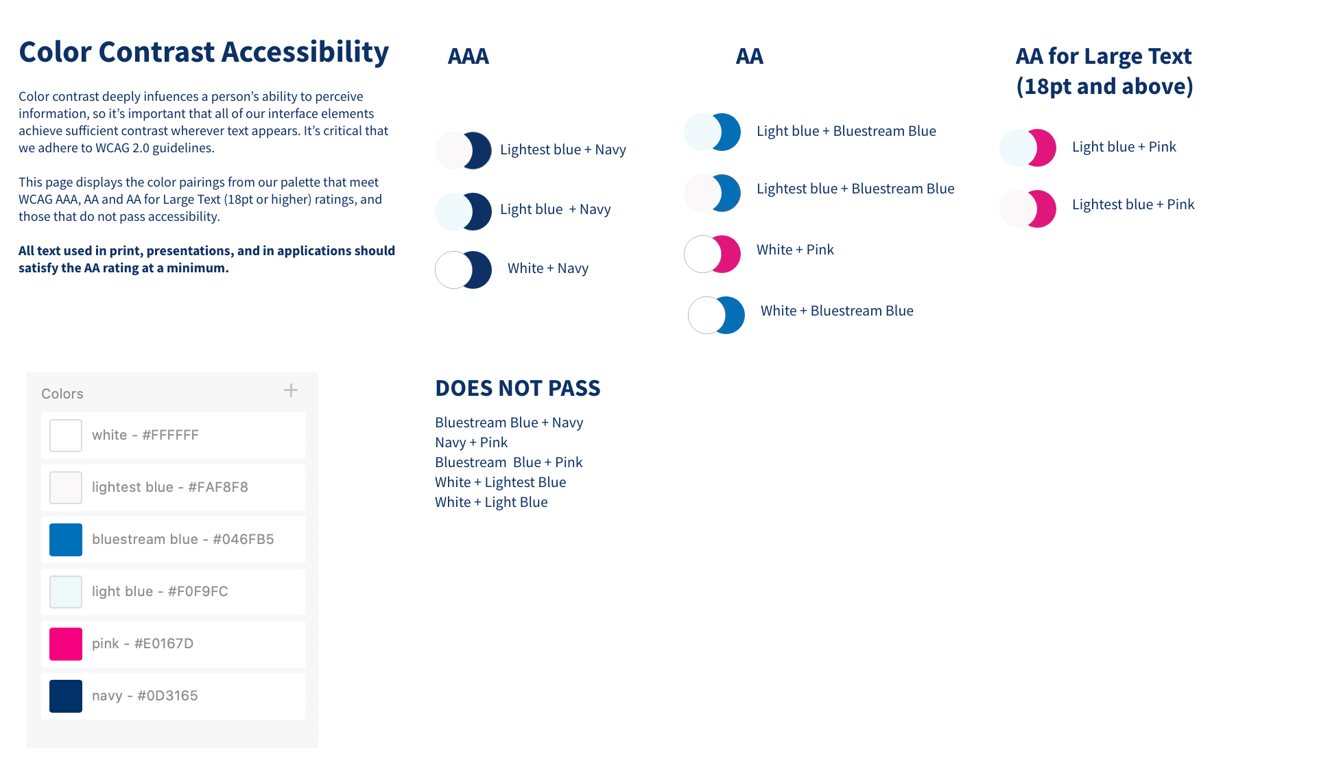
I aligned internal stakeholders by sharing accessibility guidance through presentations and documentation, and by sharing a centralized online reference for color contrast standards.